How to Master Data Storytelling with Google Looker Studio: Transform Data into Insights
- Rajeev Rai
- Mar-11-2024

In today’s data driven world, where information (content) is omnipresent and easily accessible, analyzing your data has become more critical than ever.
Therefore, It is a marketers, and analyst’s job to transform data into actionable insights with the help of storytelling.
And one tool that has been extremely useful for me, to turn data into stories, is Google Looker Studio.
In this blog,I’ll show you how you can master Data Storytelling with Google Looker Studio.
Table of Content
Why Google Looker Studio?
First, let’s understand why you should use Google Looker Studio for data storytelling.
Looker Studio is a free data visualization tool by Google. You can build interactive dashboards by connecting data sources like Google Analytics, Google Sheets, Search Console etc. And you can create beautiful charts, graphs and derive insights from your data.
Therefore, you can also use the dashboard as a presentation for your clients, team members or stakeholders.
But if you miss to present the report, you can also share the live link of your dashboard or automate the dashboard to send weekly or monthly reports.
These are some features for data storytelling with google looker studio.
Use it yourself to create a clear and impactful narrative for your data.
The DIKI Pyramid: From Data to Insight
How do I take data and make it meaningful?
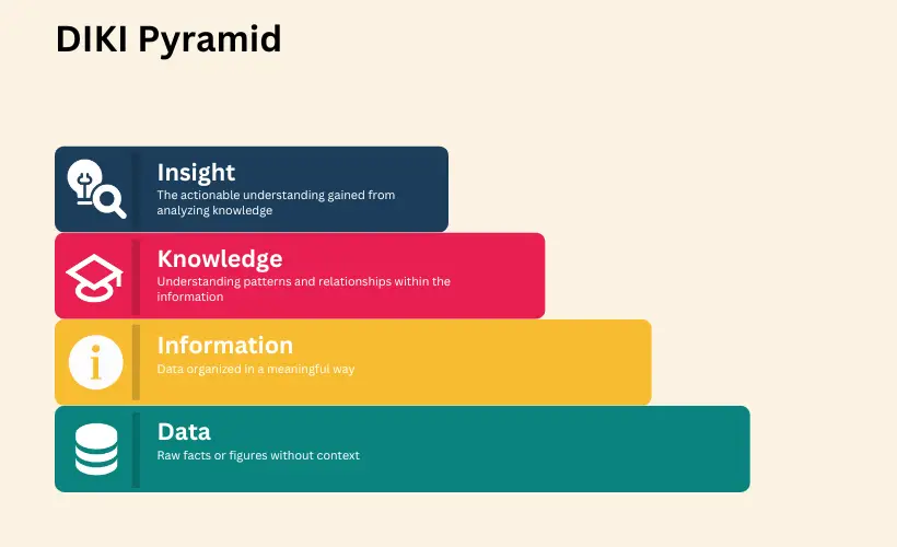
Data is just skeleton, its unprocessed facts and figures in its raw form. In the computational world, data can be in the form of spreadsheets, MXL, JSON etc.
But when these unprocessed facts and figures are organized with context, they become information.
And data storytelling with Google Looker Studio helps you transform this information into knowledge, and ultimately, insight.
A helpful framework to understand this transformation is the DIKI Pyramid — Data, Information, Knowledge, and Insights.
As you move upward the pyramid, remove unnecessary details, and reduce data down into information. Then provide more meaning and context to the knowledge and highlight specific things to get insight.
Building the Data Source
As a Digital Marketer, I collect a lot of data about the user’s experience on a website or how a campaign is performing.
So for raw data, I am going to use Google Search Console as a data source.
Google Search Console tracks organic search performance metrics for your website. Like Query, Impressions, Click through rate, average position etc.
So, I will use this raw data for our storytelling, and find trends and relationships between the metrics across different categories.
Crafting the Story: Data vs. Information
One of the core principles of Data Storytelling with Google Looker Studio is the transformation of raw data into processed information.
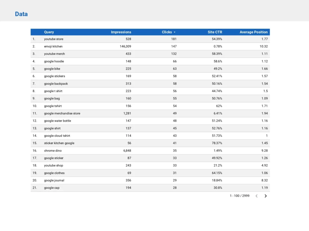
Information is giving perspective to data. So data becomes information when a person can understand what it means.
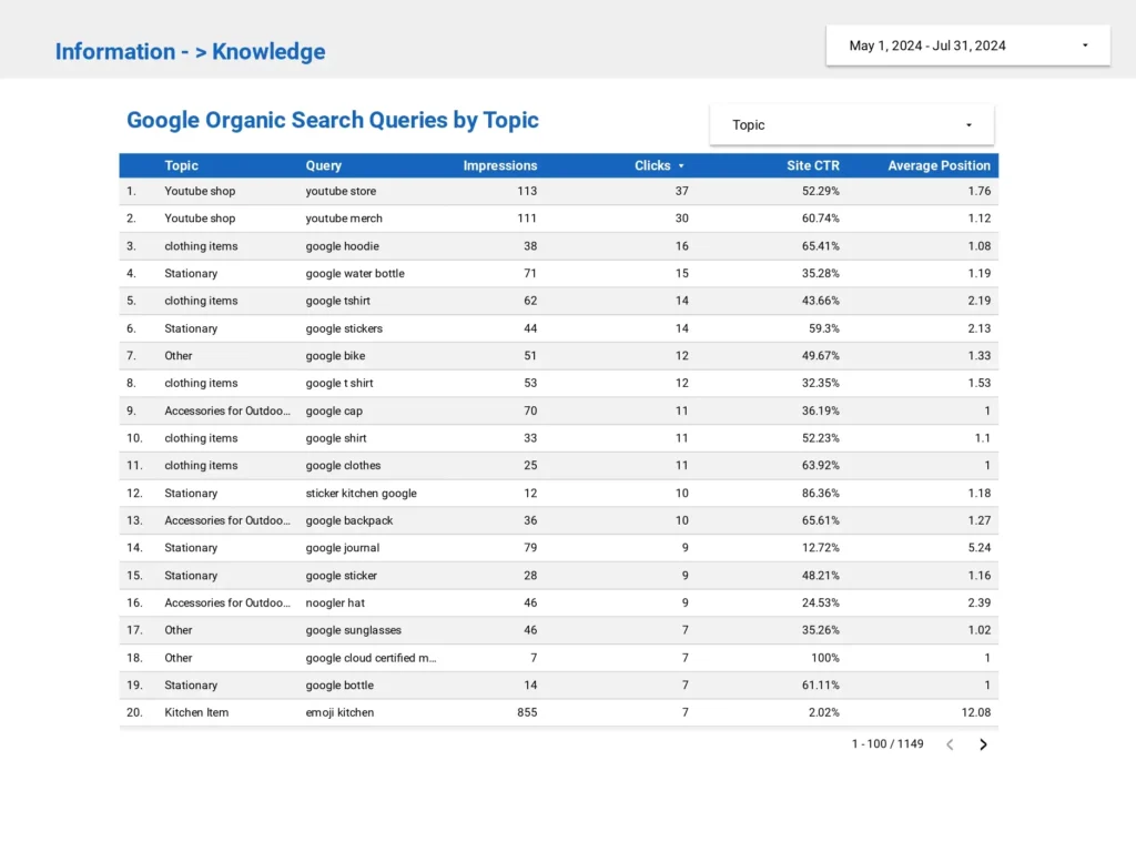
In the below table you can see five columns that represent unique metrics. But if you don’t come from a marketing background you wouldn’t know what these metrics represent.
As we are using Google Search Console for our raw data, we are going to use 5 key metrics for our storytelling:
- Query: What are users searching for?
- Impressions: How often does your website appear in the search results?
- Clicks: How many times do users click on your website?
- CTR: The ratio of clicks to impressions.
- Average Position: Where your site ranks for a particular query.
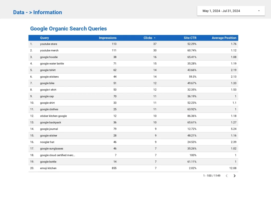
And to refine our data more to get clearer information always remove unnecessary data.
For example, in our Google Search Console data source, I will exclude null values. Why? Because these values may skew the data and take the focus away from broader, more strategic keyword performance.
Knowledge: application of data and information
Knowledge is understanding the “how” part of your data. Therefore, knowledge is collecting the appropriate information using the appropriate tools.
And If you run an SEO campaign, then you might want to know how your campaign is performing.
But your goal should not only be to report the data, but also interpret the relationship between your data.
That could be a relationship with time, and it often is. That’s one of the most important relationship that we understand how does a metric change over time.
Other examples would be like, What does a high CTR with a low average position tell you? Perhaps your page needs a stronger SEO strategy to rank higher.
With Google Looker Studio, you can easily build a visual story around these relationships, using charts, heat maps, and trendlines.
Classification: Bringing focus to your data
Classification is one of the important applications of knowledge in Data Analytics. The idea of archetype and the idea of this vs that is very familiar.
When you classify your data in a group you narrow your data down to a specific content area. So when you create some grouping you understand things better.
By using Google Search Console data, you can group your queries by topic to understand your website’s topical authority. Because Google no longer looks solely at individual keywords. It evaluates your authority within entire topic clusters.
Creating topic clusters of your queries in Looker Studio allow your clients and team members to interact with and explore the data in more depth.
This idea is helpful in understanding where we have strength that we can build on to get more visitors to our website and hopefully, share our message with people to get customers to have more impact.
Use Visuals, filters and context
Visuals
One of the powerful ways to tell a compelling data story is through visuals.
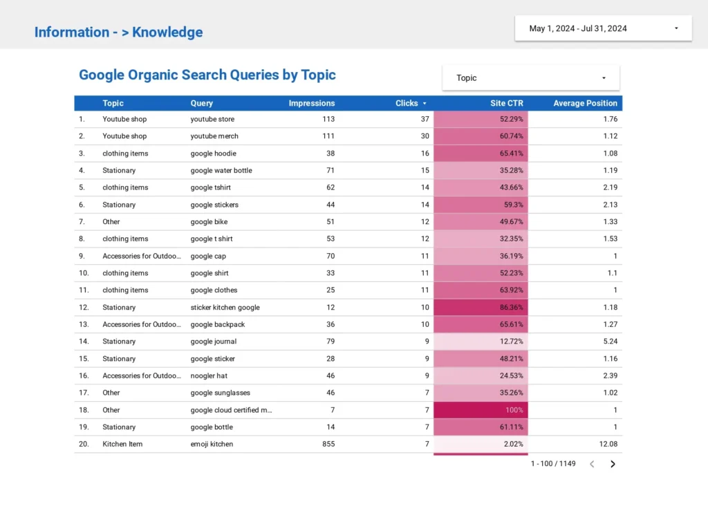
And for Data Storytelling with Google Looker Studio, you can turn your raw data into engaging heatmaps, bubble charts, and line graphs.
For example, a heatmap can draw attention to the most critical metrics, such as CTR and average position, highlighting areas where your site is performing well and where it may need improvement.
Color can be a dimension too, helping you visualize trends and patterns. Color can be useful to distinguish between different metrics and data points, which can provide a clear and intuitive visual representation.
Filters
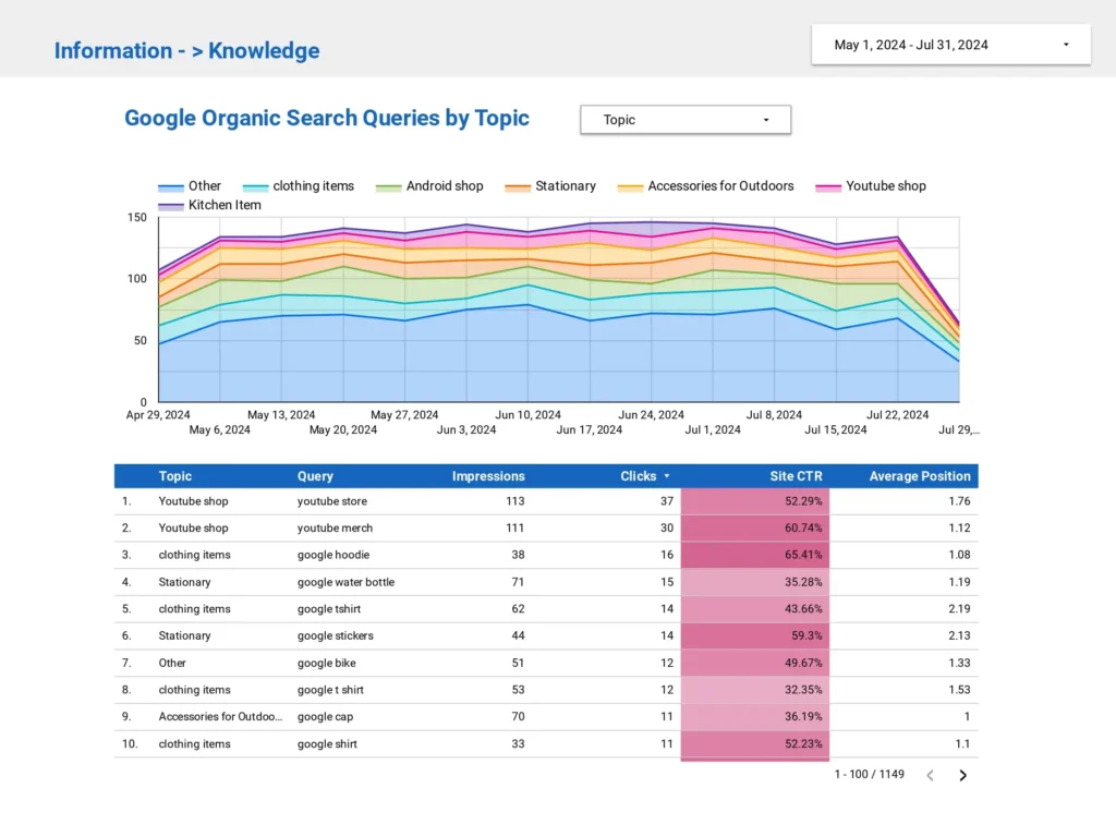
When you add a filter in your dashboard, you give an option to sort data. Therefore, I have added a topic filter on the page.
And, If you want to dig into a topic you can select the topic and it will show the data for that topic only. Now you can see what the queries people are using for that topic.
This gives an opportunity to a person to interact with the data. That’s an important aspect of storytelling with data in general, is that you really should think about stories as participatory.
The idea of dashboard is that you can dig deeper into data so you can choose your own adventure style story, you can explore, and that’s something you can do in google looker studio.
That’s what makes data studio powerful in comparison to google analytics, where you cut and paste a chart in slide presentation.
Context
The other thing to do is really valuable to do is to describe what the person is looking at, because a user will be confused about what i am looking at, what is the focus? So always add the context.
Some useful tactics for providing context having a reference line or gauges. Many chart types support having a reference line.
Knowledge is providing context.

Knowledge to Insight
Finding insights from your data is a cognitive and analytical process. Therefore, insight is the true essence of Data Analytics.
Insight is about focusing on what’s most important but getting at the why’s? As you move from data to insight, ask the “why” behind the numbers.
When you build a dashboard, there is always a goal in your mind like increasing revenue or traffic. And there’s a question of how do we do that?
Why is CTR dropping for certain queries? Why are impressions growing, but clicks are stagnant?
By asking these questions and providing the context to answer them, your client or team members will be able to understand not only what is happening but also why it matters.
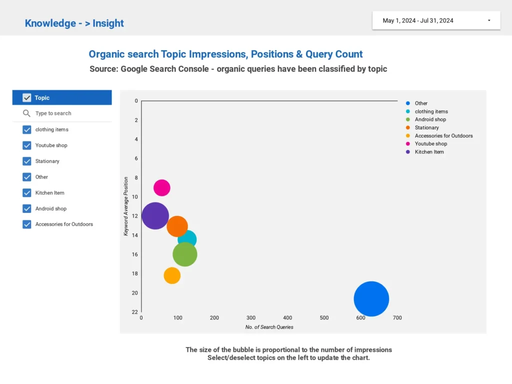
Bubble charts, in particular, are highly underutilized charts in data reporting. It is a good way to draw attention for things that matter most.
In this bubble chart, x axis is the unique queries our website is ranking for, size of the bubble is the impressions, y axis is the average position.
This type of visualization makes it easy to see which queries have the most visibility and rank, all at a glance.
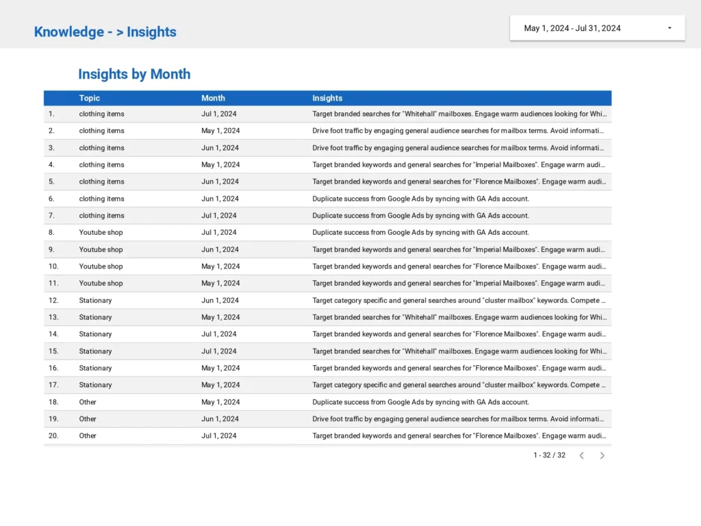
A couple other tactics that are valuable is pulling data from google sheet. You can add a table for insight and show which campaign performs better in which month.
Conclusion
A great dashboard doesn’t just present data — it lets users explore the story themselves. The interactive nature of Google Looker Studio allows you to filter and interact with the data.
Therefore, adding date pickers, topic selectors, or even videos, create an immersive storytelling experience where you can dive deep into the insights most relevant to you.
This makes Data Storytelling with Google Looker Studio more dynamic than static reports or PowerPoint presentations.
But Data Storytelling with Google Looker Studio is not just about charts and graphs — it’s about transforming data into meaningful insights.
Whether you’re visualizing data from Google Search Console or Google Ads, Looker Studio allows you to create interactive data stories that drive better decision-making.
By mastering the art of storytelling with Looker Studio, you’ll not only inform your audience — you’ll inspire them to take action.